A new UScellular brand and logo was unveiled today. Previously known as U.S. Cellular, but now UScellular, the company is the fourth largest postpaid wireless carrier in the U.S.
The company last changed its look in 1999. A company spokesperson informed Telecompetitor that the new UScellular logo and brand achieves a number of objectives.
“The new logo honors the past while taking our brand into the future with two key features: The blades of the star signify the power of individuals coming together to create positive change, and the emphasis on ‘US’ highlights our commitment to all of the communities we serve,” the UScellular spokesperson said.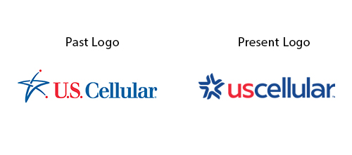
A new UScellular logo is illustrative of a number of telecommunications companies who have changed their branding or name in recent weeks. Those companies include CenturyLink, now called Lumen , and Windstream, which updated its logo but not its name.
We’re starting a pool here at Telecompetitor. What major telecom brand is next up for a rebrand? My vote is T-Mobile. What do you think?