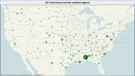
 There is a saying that a picture is worth a thousand words. But when it comes to Universal Service data, a better saying might be “A map is worth a thousand spreadsheets.”
That’s the thinking, anyway, behind an interesting new interactive resource available at www.usfbroadband.com.
The site is the brainchild of Paul Salasznyk, a Ph.D. and self-described “data enthusiast” whose day job is statistical analysis practice lead at Computech, where he heads up that organization’s efforts to compile data for the National Broadband Map, which was unveiled in February and updated last month. USFbroadband is a completely separate project that Salasznyk undertook on his own time.
Salasznyk told Telecompetitor that he was inspired to create the USFbroadband site because he found data available from the Universal Service Administrative Company to be difficult to work with and visualize. He and colleague Ian Locke downloaded data from the USAC site and created some dashboards to enable end users to, for example, create their own maps to depict data such as USF receipts from various funds (high-cost, schools and libraries, etc.) by state or by recipient.
“For an eight billion dollar a year fund, the [interface] should be top notch,” Salasznyk said.
Salasznyk and Locke supplemented the USAC data with additional data from the National Broadband Map and from the U.S. Census Bureau, enabling users to, for example, see the number of competitors offering broadband service in a particular state or service provider territory –or the percentage of people by income or education level in an area.
USFbroadband.com doesn’t take sides in the USF reform debate. Instead, users can use the site to draw their own conclusions.
I gave the site a quick sanity check, typing in several service providers with whom I was familiar to see if the information seemed accurate and it did. I did notice, though, that the site creators only included wireline carriers that receive high-cost funding and not competitive wireless providers. Salasznyk confirmed that, adding that the low-income data also includes only wireline carriers, but that the rural health care as well as the schools and libraries data includes both wireline and wireless providers.
I also noted that the site does not have a roll-up feature enabling users to see, for example, the total amount of funding that some of the larger carriers get for all of their various operating units.
When I mentioned my observations to Salasznyk, he said I’d given him some ideas for future enhancements. I told him Telecompetitor had a lot of very engaged readers who would probably respond to this post with some feedback of their own and he said he was eager to hear it.


